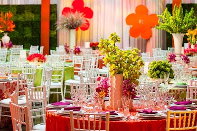
Vibrant colors reverberated throughout the Corcoran Gallery of Art for the 58th annual Corcoran Ball, with each gallery boasting bright spring hues like yellow, coral, pink, blue, and green. The team behind the ball's look took inspiration from the color palette and art in the galleries to create individual looks for each room.
The museum's Women’s Committee turned to Jack Lucky of Jack H. Lucky Floral Design, Occasions Caterers’ Eric Michael, and Barbara Grazzini of Perfect Settings L.L.C once again to transform the museum for the ball. The 721 guests dined on a three-course meal at elaborately decorated tables set up throughout the museum’s eight galleries, atrium, and rotunda—the only time food and drink are allowed in these spaces.
Check out how the team created an effective design without overpowering the environment.


