With a production of Gilbert & Sullivan’s The Pirates of Penzance making its debut this month, the New York City Opera’s spring gala on March 15 had an obvious theme. But that prompted a certain question of style: How much pirate is too much pirate?New York City Opera director of special events Sarah Denton oversaw the affair, which saluted outgoing general artistic director Paul Kellogg as well as longtime season sponsor Altria Group. She said the look and feel of the event began with the invitation. “We used a pirate theme, but because we were honoring Paul and Altria, we wanted to give it a regal look and feel,” she said. The invite’s color palette evolved from an initial red and white to a final gold and cream, to communicate a luxurious and expensive feel. Denton described the ultimate concept as “a pirate theme with a subdued and glamorous feel to it. Very chic.”
For design, Denton again enlisted David Stark, who incorporated the colors of the invitation, the stage set, and even the promenade where the dinner and dancing would take place into the decor at the New York State Theater. Stark realized from the beginning that creating a pirate-theme setting appropriate for a formal gala required some restraint. “The question is, how do you do it in an elegant way?” he said. “How do you step up the elegance but still make it fun?” There was also the challenge of doing it on the lean-and-mean budget of a not-for-profit organization.
The solution was an emphasis on texture and color, orchestrating a few elements to create a big impact, and the use of surprising materials—which in this case included 15,000 chocolate gold coins. (This wasn’t the first time Stark created a visually compelling decor with relatively inexpensive materials: For last year’s fall gala, he used 5,000 blue and white streamers to great effect in the same space.)
Denton praised Stark’s ability to deliver high-end design with limited funds. “He’s very good at working within our budget but still making it look fantastic and luxurious,” she said. “He’s very sensitive to our nonprofit needs.”
—Mimi O’Connor
Posted 03.21.07
Photos: BiZBash
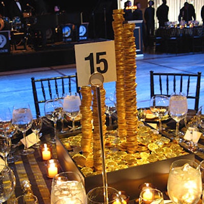
Some of the tables’ centerpieces featured precarious stacks of gold coins. To create them, Stark and his staff drilled holes into the foiled-wrapped chocolates and then used a rod to stabilize the pile.
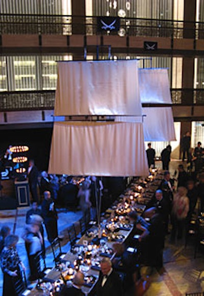
Sixteen-foot-high ship masts rose from the honorees’ tables, with the aid of metal plates used to anchor the towering welded structures. Earlier in the evening, Stark integrated the pieces, topped with gold satin sails, into the bar during cocktail hour.
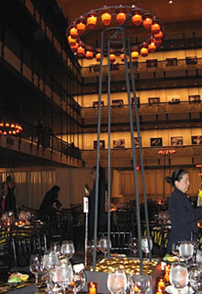
Some centerpieces featured a pile of gold topped with candleholders ranging from four to six feet high, which supported a ring of gold votives.
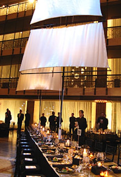
The gold-and-black color scheme, evident in such elements as table linens and lighting, capitalized on the gold-and-black interior of the theater’s Grand Promenade. The gala raised $950,000 for the New York City Opera.