Pantone’s Color of the Year announcement always provides inspiration for event designers and an exciting pop culture moment, but the color company is also becoming more involved with physical events through new partnerships with major brands.
In the past year, the Pantone Color Institute—a consulting service within the company that predicts global color trends and advises companies on color in brand identity and products—has lent its expertise to eye-catching consumer activations for new products and campaigns.
At Miami’s Art Basel in 2018, Marriott’s Tribute Portfolio tapped the institute to help create a traveling art installation inspired by “Living Coral,” the 2019 Pantone Color of the Year. In New York earlier this year, LG partnered with the institute to create a pop-up café that highlighted Pantone’s summer color palette through bakery items and LG products. The Pantone Color Institute also created a purple hue for the new Macallan Edition No. 5 whiskey, which was then rendered in a 360-degree pop-up experience that explored color creation and whiskey making, held at the Oculus at Westfield World Trade Center in New York.
Laurie Pressman, vice president of the Pantone Color Institute, has been with the company for more than 20 years. She explained that the company’s mission is to open people’s eyes to “all that color is and what color can do.” Becoming involved with brand events is Pantone’s extension of this mission.
Pressman spoke with BizBash about Pantone Color Institute's strategy regarding brand activations, how it chooses brands to partner with, its role in an activation’s creative direction, and more.
Why has Pantone Color Institute become more involved with consumer brand activations?
At the base of Pantone, we’re a color language. There’s also a side of Pantone that is about education. That has been a focus for us through the Pantone Color Institute since 1986. The Pantone Color Institute was started on consumer preference studies. Then we moved into trends, to Color of the Year, to the colors for Fashion Week. We’ve worked with many companies on visual brand identity and colors for palettes. One thing that always sticks with me—this comes through Leatrice Eiseman, the executive director of the Pantone Color Institute—is that our goal is always to start a conversation around color. We see color as lifestyle.
As we see—in our increasingly digital society—more people trying to create connections with brands and engage with brands, we have more companies we’ve been working with that want to tell a backstory. They want to create more texture and emotion around what they’re doing. Color expression has become much more top-of-mind for people. I think it’s this confluence of wanting to connect to brands, wanting to experience something, and color being a way to express who we are. For us, as those who look at color as a lifestyle, it’s been a great opportunity for us to get involved with so many different areas and help brands leverage the power of color to be able to tell their story.
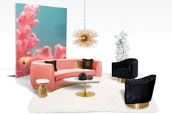
 “Pantone Pantry by Tribute Portfolio” included more than 20 cabinets and drawers throughout the space, as well as an infinity mirror aquarium and a surprise confetti cabinet.Photo: Elizabeth Lippman
How does the Pantone Color Institute choose which brands to partner with?
On the consumer-facing side, it’s about who’s of like mind. Who do we hang with and who makes sense? Who has a similar goal and sensibility to Pantone? On my side, a lot of what we do is behind the scenes and consulting. There are many brands we work with for visual brand identity that are not looking to use us to tell a story; they’re using it to make sure the color is consistent across uniforms and marketing materials. When it comes to some of these more visible partnerships, it has some of the same pieces: How can we help someone better tell their story? When the Macallan came to us to select the color for the outside packaging for their limited edition, right away it told me they were very forward thinking and innovative. Because here they are, looking to use color to position themselves to a different market, to stand out on social media, to tell a story that’s different from what they were already saying. The companies we’re partnering with tend to be more forward thinking and innovative. They understand that this is one more way to get their message across to the audience they’re trying to reach.
I think social media has completely upended the way we live our lives and how people run their businesses. We can see it for Color of the Year. The number of PR impressions and the importance of that program has grown exponentially as a result of social media. I look at this in the same way. As people look for more channels to expose their message, they’re looking for visual mediums and color really plays well to that. Color can help them enhance the story and connect with their audience. We’re a good partner for that.
 LG partnered with the Pantone Color Institute to launch a pop-up café in July in New York’s SoHo neighborhood. The pop-up highlighted Pantone’s summer color palette, serving lattes inspired by the colors Pink Peacock, Tangy Turmeric, Aspen Gold, and Pepper Stem. The café also served color-coded desserts created by Amirah Kassem of Flour Shop.Photo: Ann-Sophie Fjello-Jensen
What would you say is the most innovative event you’ve been a part of in the past year?
I don’t want to say something that sounds like one brand versus another brand. But when we’re working with a partner, one of the things I’m very cognizant of is what can we do that’s different. How do we tell this story differently? I don’t like to go back and do the same thing twice. It’s one thing if we do the same thing with the same brand in a different city—that’s taking something that they’ve created, owning it, and moving it someplace else because it’s successful.
For the café with LG, I thought they did a tremendous job of putting it together. It wasn’t just about us. We were just one dimension of the story. I certainly wouldn’t want to go do that with another brand, because we’ve done that and it won’t be as interesting. The same thing goes for the Macallan. I would say the first time we really walked down this path was with Universal Studios and creating the color Minion Yellow [for the Despicable Me franchise]. We’d never played in the animation space before. But some things are less heard of. We did the neon blue for the show Bates Motel. I loved that, because it was the first time we did a metallic neon. To me it’s not always just about the press—it’s about what’s new, what’s different, and how somebody is using color in a different way to tell a story.
When you partner with a brand for an event, who takes the lead? How active are you in the creative direction?
It depends. Typically we’re supporting it. With LG, we were supporting their idea. I would say the same thing with the Macallan. Keep in mind, at the base of us we’re a color standards company. We’re not a marketing or advertising agency. At the same time, I’m sitting here saying color is lifestyle. Anything I can do to help bring something to life in the world of experience, I love that. But it has to make sense for us and it has to make sense for the brand.
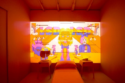
 Walls with digital art on OLED TVs highlighted each color in the space. The pop-up was produced and designed by G&R Live.Photo: Ann-Sophie Fjello-Jensen
How do you measure the success of these events on your side?
They’re typically monitored through social media impressions and PR impressions in general. Pantone Color Institute is a business unit for us. My grounding through the history of Pantone is understanding the importance of keeping the brand relevant, modern, and contemporary. That’s huge. Otherwise we could be the next company that is no longer important. All these things keep Pantone top of mind, and have almost turned us into a part of pop culture, especially with Color of the Year. At the base, we’re a B-to-B company selling color standards. Today, you need to be more than those things. There are so many other different dimensions to Pantone. Us being involved in the world of trend helps to ensure that the colors we continue to add in the different palettes are going to be relevant and going to be on trend, because we’re involved in creating trends for color. Everything feeds off one another.
As a color expert, what is a design choice that you don’t see enough of at events?
I’m looking at this very myopically. I’m looking at it as how you bring color to life—how do you see it, how do you taste it, how do you smell it, how do you feel it, how do you hear it. If you ask me, it would be how do you use color to touch every single sense. Does that apply to everybody? I don’t know. I think what the Macallan did was really smart. The story there was comparing the complexity of blending to the complexity of the color we ended up selecting for the outside packaging. That was an interesting and unexpected story. The whiskey and the taste of the whiskey is obviously going to sell the whiskey. But I think they know how to portray themselves in a very interesting way, which is engaging to their audience.
 To celebrate the Macallan's launch of the Edition No. 5 whiskey, for which Pantone created a custom purple, the two companies partnered to host a pop-up that was open to the public at New York's Oculus in September. The Macallan Whiskey & Color Experience was housed in a circular structure with interactive, color-coded rooms inspired by the whiskey-making process and color creation. In a red room, guests could sniff aromas found in Edition No. 5 and pose for photos at a desk, backed by a whiskey-theme wall with Pantone paint chips.Photo: Courtesy of the Macallan
Why do you think Color of the Year resonates so much with people?
Because it’s fun. I think it’s a moment in time. Without revealing any names, a couple years ago when we were talking to an editor at a paper about a particular Color of the Year, the concern expressed was ‘Well, no one is going to want to talk about this now. They’re going to want to talk about politics.’ But we said no, this is exactly why people want to talk about this. Because it’s fun, because it’s light, because it’s uplifting. I think people feel like they learn something. One thing we learned with Color of the Year was in 2016, when it was the blend of rose quartz and serenity. Prior to that, we’d explain why we chose the color, but we never really went in depth.
When we were doing our press interviews, people were asking us to dig deep. I thought, ‘Wow. We really need to be thinking more about how we got to the place we got.’ Because typically it’s not just one piece. Yes, there is a primary message. But there are always supporting messages to bolster that. That was an eye-opening experience for us, to realize that. I think people like to learn. I think it’s the educational aspect. I think people find it interesting that when we talk about Color of the Year, it’s a color that reflects a moment in time. It’s topical. And in all the craziness of the world we live in, color is just fun. Everybody has a story about color. I think it makes people feel good.
 The self-guided experience ended with the reveal of Pantone's color, the Macallan Edition Purple, based off the new spirit. Guests could sample the spirit from a bar in a purple-hued room.Photo: Courtesy of the Macallan
In terms of events, what goals does Pantone have for the future?
I don’t know that I think like that, honestly. It’s always about what we can do that’s new and different. Some of it is just intuitive. I think you’ll be excited to see what we do for Color of the Year 2020. I think the events we do have to be reflective of what’s taking place. Doing an event just to do an event doesn’t make any sense. How do we further our goal, which is to highlight the role of color in the world today? I think back to the first well-known celebrity who came to us for a color, which was Jay-Z. It wasn’t about any kind of PR for him. He just wanted his own color, a Jay-Z blue. The goal for us is exposing the importance of color in a way that gets people talking. So whatever that means in two years from now or after the 2020 event, I don’t know. There are things we’re talking about with other people, but they haven’t been brought to life yet.
This interview has been edited and condensed.