Since its inception in 1984, the TED Conference has been known for being a model of innovation—in format, content, layout, interactivity, and more. So it’s not surprising that its conference app is also, well, uniquely TED. It’s designed by an in-house team with a singular focus on serving attendee needs. And while other conference and event hosts may share that mindset, for TED it manifests itself in ways that are uncommon. There’s no integration of social media, no sponsor logos, and no upfront information about an attendee’s title and company name.
“I go to a lot of conferences, and I’ll download the apps to do research. A lot of conference apps, the experience design is very organizer-centric,” says Thaniya Keereepart, TED’s head of mobile and platforms. “We look at it from the lens of what would I want to see? What would help me as an attendee of the conference to make the experience better?”
For social media, that means promoting the event hashtag—for the conference that just wrapped up Friday at the Vancouver Convention Centre it was #TED2016—but not creating a mechanism for people to post from within the app. “It’s kind of a frivolous feature in my opinion to create a brand new environment for tweeting when most people would go to Twitter to tweet or whatever else they would use to tweet. It’s a habit they’ve already established,” Keereepart says. “As far as TED is concerned, if we want people to tweet, all we have to say is #TED2016 and then you do what you want in your environment.”
Content within the app is streamlined to show attendees what they need to know at that moment. The main screen shows which session is in progress, what’s taking place in the social spaces, and other timely details such as a brief weather report. What it doesn’t include is links to more detailed content. “For the session description we have literally one paragraph. We don’t have ‘tap here to read more.’ Why? Because we want you to attend the conference, go in there. We give just enough information for you to physically exist in the space,” Keereepart says.
In fact, while some conference apps are loaded with additional blog posts, videos, and more, TED’s is intentionally light. “If the purpose of this app is to physically connect people together, when you have content what ends up happening is people end up putting their phone up to read. And that’s what we don’t want to happen," Keereepart says. "We want the app to be a mechanism for physical engagement.”
Sponsors, which TED call partners, are also nearly invisible in the app. Rather than showing logos and information about sponsors’ products and services, they are referenced in relation to what they are offering at the event. “For example we don’t show a Target logo. We lead with, ‘There’s a grassy area and you can go there and get a custom artwork of your dreams.’ If you craft the message of what the user wants to know, not a corporate logo, that’s what drives engagement, because it’s a value-add for the person using the app,” Keereepart says.
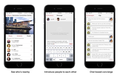
Most of the app’s features are focused on creating connections among attendees. For instance, it shows their general function—physicist or psychologist—but not formal titles or company names to keep the focus on ideas and not roles. There’s in-app messaging—which increased by 58 percent compared to 2015—as well as the ability to introduce two connections to one another. Conference badges are equipped with Bluetooth low-energy tags, which track attendees' movement throughout the venue unless they turn it off. In the app, this tracking system serves two functions: it allows attendees to see where crowds are gathering—for example it may indicate that 100 people are in line to pick up gift bags—and it allows attendees to see where specific people in their network are at any moment, including a link to their location on the venue map. “These are little design decisions that help people find each other,” Keereepart says.
To create a connection between conference attendance and the online world of TED.com, the app allows attendees to click a heart next to speakers if they want to receive an email once that talk is available online.
New this year, organizers also integrated the conference concierge service into the app. In addition to the physical information desk, an online concierge, dubbed Gigi, was available 24 hours a day in the app. Using a text interface, attendees could ask questions and receive an answer within two minutes. Organizers say there were more than 1,200 messages exchanged between Gigi and the attendees.